Architecting visual emotion through color science. Our professional harmony studio enables you to generate sophisticated, mathematically-balanced color schemes for high-end digital products, ensuring branding consistency and accessibility compliance.
How mathematical relationships between wavelengths create beauty.
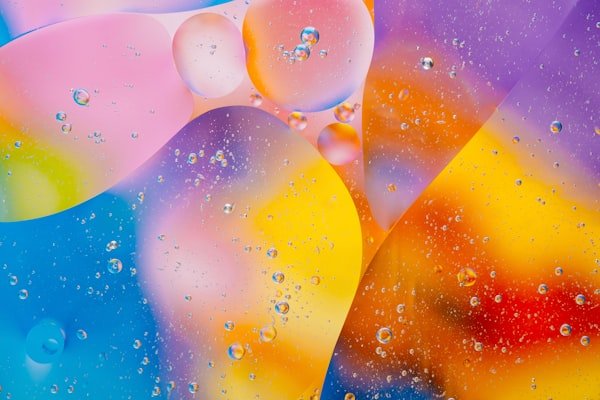
By picking colors spaced 120 degrees apart on the wheel, we create high-energy schemes that remain visually balanced and professional.
Adjacent colors on the wheel are inherently pleasing to the eye because they mimic the natural gradients found in nature, like sunsets or forests.
Colors evoke specific emotions. Blues project trust and stability, while oranges and reds stimulate action and urgency in design.
Modern design requires WCAG compliance. Our distribution radar helps you visualize if your palette has enough contrast for readability.
Our tools are built with WCAG standards in mind, ensuring a seamless experience for users across all devices and assistive technologies.
We process all data locally in your browser whenever possible. Your sensitive information never touches our servers.
Clarifying technical inquiries about color spaces and design workflows.